It doesn’t matter if my income grows 500% if it started out at four cents…
I am sure you have heard plenty of people make the argument that global capitalism “lifts all boats.” Yes, as productivity increases, the rich get much richer, but the poor get richer too. Fewer people nowadays are living on $1 a day than ever before. An American poor person today lives better in many ways than a rich person in 1850. If people are unhappy, it’s because they irrationally fail to appreciate that their lives are Actually Good.
In its most extreme, Pinker-esque version, the argument can seem absurd on its face: Telling people less well-off than you that they should be more happy is not actually going to make them happy and does nothing except help you rationalize your failure to help them. But the whole “everyone is getting richer, actually” thing is said by both critics of inequality and defenders of it.
Have a look at this chart:
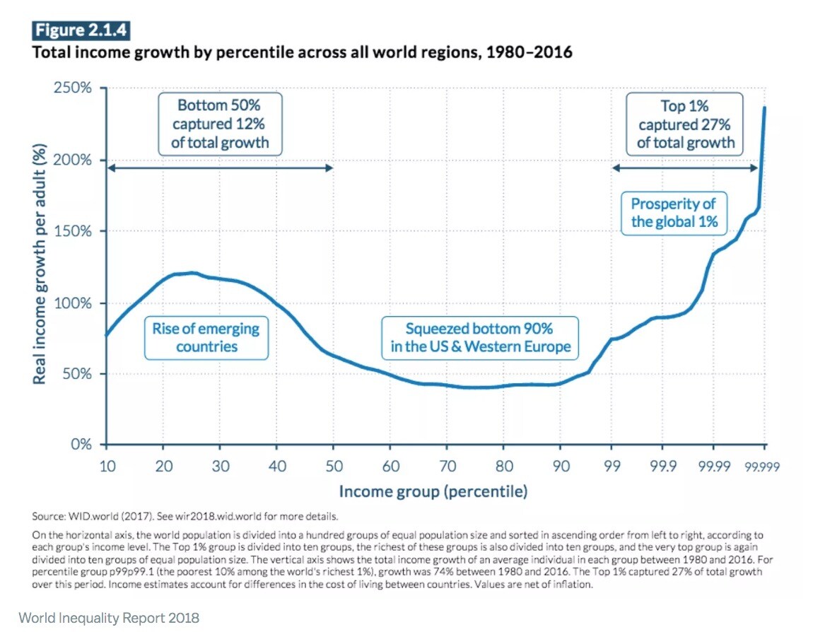
Dylan Matthews of Vox has cited this chart in critiquing Oxfam’s portrayal of the world as divided between the extremely wealthy (who own nearly everything) and the extremely poor (who own nearly nothing). Matthews is not a defender of unchecked free market capitalism, but he does think this chart shows that everyone is getting meaningfully better off. He writes:
The rich really are getting preposterously rich. And there’s a real argument to be made — the political argument that Oxfam’s statistic is meant to make — that making taxes more progressive and directing the funds to, say, cash payments to poor households would lead to faster poverty reduction than has occurred under the current system. One analysis suggests that up to 50 percent of global extreme poverty could be ended if developing countries adopted higher top tax rates. But the rich getting richer doesn’t preclude the poor getting richer too, and while the middle classes in the US and Europe have seen less income growth than either the poorest people in developing countries or the richest people on earth, the world’s progress against extreme poverty is real and notable. It’s also, I’d argued, unhelpfully obscured by stats like Oxfam’s.
This chart is used a lot in inequality debates. It is referred to as the “elephant graph,” and credited to economist Branko Milanovic. It has been called the “hottest chart in economics.” Critics of inequality cite it to show that while the people at the very bottom and the very top are doing better and better, the people in the middle have seen much less income growth over time. But defenders of capitalism also use the chart, pointing out correctly that it shows everyone’s incomes growing. PBS’s Paul Solmon asked Milanovic about the chart, saying:
I’ve seen the elephant chart used in a classroom in a way that was suggesting, perhaps subliminally: “Hey, inequality isn’t really so bad because look how many people are benefiting from economic growth around the world. Global inequality is actually decreasing.”
Milanovic acknowledged in response: “You know, there is some truth to that… [If] you actually look at this chart, you basically don’t see any group of people who have a decline in income.” So capitalism is lifting all boats!
But do you notice something a little odd about the chart? Look at what it measures: percentage of income growth across people at different percentiles in the income distribution. Why would we care about percentage of growth, though? Surely what matters is not how much more money you have as a percent of what you used to have, but how much money you have, period. For example: Say the people at the bottom started off earning $0.05 a day, and the people at the top were earning $10,000 a day. If the people at the bottom saw income growth of 100 percent, they’d still only be earning 10 cents a day! Whereas if people at the top saw 50 percent growth, they’d be earning $5,000 more a day.
So this chart is virtually meaningless on its own in telling us anything useful about the real world. If the line were very high on the left side of the X-axis (i.e., people at the bottom had seen huge percentages of growth) and very low on the right side of the X-axis (i.e., people at the top had seen only very small percentages of growth), the chart would be used to say: Ah, you see, the poor are benefitting from capitalism even more than the rich are! Their incomes have gone up by 1000 percent! But if that’s the difference between $110, whereas for rich people it’s an addition of hundreds of thousands more dollars, then actually the rich are benefitting way, way more.
Percentages are misleading here, because X percent of a small number is a much lower amount than X percent of a large number. We can say “Ah, the incomes of the rich and the poor are growing at the same rate.” But for a poor person, the addition may be the cost of a bag of chips, whereas for the rich person it is the cost of a Maserati. By treating these percentages as comparable, we fail to see just how minuscule the “trickle” that is “trickling down” to the poor actually is. Yet people insist on finding meaning in the “percentage of income growth” rather than the raw amount. The Brookings Institution has a paper critiquing the elephant chart and arguing that the percentages are far more even than they look. They conclude from this that “the data do not support the idea that the poorest people are being left behind, nor that the richest are taking all the income gains.” But that’s nonsense: Even if the elephant graph were completely flat, the rich would be seeing increases in the thousands or tens of thousands of dollars while the poor would be seeing increases in the dozens of dollars.
Jeremy Lent, in explaining why Steven Pinker is largely full of shit, has pointed out that when you actually look at dollar numbers, rather than percentages, you can see that globally, poor people are not actually doing much better at all compared to how much better rich people are doing:

This graph shows the “percentage growth” on the blue line and the dollar-amount growth on the green line. As you can see, poor people did not actually receive many more dollars in this time, when compared with the number of additional dollars rich people received. And in fact, this chart doesn’t even begin to show you the scale of the problem. If you looked at the very tippy top of the distribution, some people would be earning millions more dollars. Lent points out that “at the current rate, it would take over 250 years for the income of the poorest 10% to merely reach the global average income of $11/day,” meanwhile the incomes of the people at the top would have outstripped them by multiple hundreds of times.
Any honest presentation of the income distribution will show that we live in a world where most people receive nearly nothing and a small number of people receive hundreds or thousands of times more. Have a look at this chart showing global income distribution in 2003 and 2013:

This is a much more realistic representation of the nature of the global economy: Most people get nearly tiny amounts, some people get gigantic amounts. This graph should really go up to the millions and hundreds of millions of dollars, which is where the line actually ends. That would reveal just how pitifully small the incomes of the majority of Earth’s population are next to the incomes of the super-rich.
Make sure to bear this in mind next time you see someone pointing out that “global extreme poverty is in decline.” What that means is that people are crossing from an extremely small amount of money to a slightly larger but still comparatively minuscule amount of money. Their incomes are still essentially nonexistent when we put them next to the incomes of the people at the top. The gap is just unfathomably wide. Those who talk about how capitalism is reducing poverty pat themselves on the back because hundreds of millions of people have gone from having $1.50 a day to $4 a day, from being malnourished to being able to afford a bowl of soup. “We’ve significantly reduced the number of famines!” they’ll say. The question, however, is not “Did the lives of the poor get better?” but “How much better would the lives of the poor be if we did not live in a world where a tiny number of people own nearly everything?” If you just look at whether things are “better” to determine whether they are “good,” then the Gilded Age was good because it was better than the Middle Ages.
There are problems with using “income” statistics in the first place. There is a strong argument that what we should really look at is wealth: the pile of money you’re sitting on, not just the amount of new money you get every year. How did the wealth of the poor grow over time compared to the wealth of the rich? How many actual assets do they have beyond mere subsistence? Here, you’ll find that 63 percent of the world population has under $10,000 in total wealth, and collectively own only 1.9 percent of the world’s wealth.
It’s very easy to obscure the extremes. Beware of statistics and charts that manipulate information in ways that disguise just how large the absolute gap between rich and poor is. Look, for instance, at this chart, from the otherwise-useful Credit Suisse global wealth report:

This chart disguises just how much wealth is contained in North America versus other regions. Look at the scale on the lefthand side. We go from 100 at the bottom to 1,000, then 10,000, then 100,000. On the chart, the gap between each interval is the same distance. But, of course, the difference between 100 and 1,000 is not the same as the difference between 1,000 and 10,000, or 10,000 and 100,000. The chart’s makers have used a logarithmic scale, where each interval is a multiple of the last (in this case, 10x). If we graphed this with absolute dollar amounts, the graph would look horrifying: We’d see that Africans have almost no wealth on average compared to North Americans, who have about 100x as much. (Jason Hickel has done excellent work showing how manipulative infographics are produced that disguise the true extent of global inequality. Truer representations are galling and make it very difficult to say that globalized capitalism is working out amazingly for everyone.)
We live in an extremely unequal world. But we also live in a world where it’s easy to bury the truth by manipulating the scale on your charts or failing to use the appropriate measurements. Do not believe the defenders of capitalism when they talk about how “rising tides are lifting all boats.” The question is: How much are they lifting your boat, versus how much are they lifting my boat? “Oh, well, your boat and my boat are both being lifted by 20 percent…” None of that bullshit, thank you very much. Be honest: Capitalism is delivering windfalls to the rich and crumbs to the poor. Yes, “extreme” poverty is declining, thank God. It should be! But most people still have nearly nothing, and some people have everything they could ever dream of 1000 times over.

If you appreciate our work, please consider making a donation, purchasing a subscription, or supporting our podcast on Patreon. Current Affairs is not for profit and carries no outside advertising. We are an independent media institution funded entirely by subscribers and small donors, and we depend on you in order to continue to produce high-quality work.


