How learning to do page layouts helped me understand the world…
When Current Affairs began three years ago, I did not have any experience in publishing and had no idea how to make a magazine. To the extent I could, I simply ripped off everything that Bhaskar Sunkara at Jacobin had done. That helped me figure out how to run the operation, but it didn’t tell me how to actually create the magazines themselves. What do you do if you want to make a magazine look like a magazine? I was determined that Current Affairs would have to look and feel “newsstand quality.” But what is “newsstand quality”? How does the Atlantic come to look like the Atlantic? There are clear differences between something that looks “amateurish” and something that looks “professional.” Articulating what those differences actually are can be more difficult.
So I went to a newsstand to study the magazines. I got a big stack of them, brought them home, and spread them out. I wanted to know what gave each one its distinctive look, and what made Serious magazines feel and look credible. The first thing I realized was that large parts of the “aesthetic of seriousness” involved using elegant “drop caps,” aka these things:

Once you have good drop caps, you are halfway to respectability. The second thing I realized was just how simple some of the basic design tricks are. Specifically, I looked at a copy of TIME magazine, and realized that, just in terms of the design, there was nothing in there I couldn’t replicate. I pored over pages like this:

And thought “Well, that seems simple enough. Mixture of big fonts and little ones, colorful pull quote, some lines in certain places. I could make this.” Then I looked at the cover of some teen and gossip magazines. And I thought to myself “What actually makes these things feel like teen and gossip magazines rather than TIME?” To find out, I actually made my own “teen magazine” page:

Making it took a while. I had to figure out what kind of colors they used, what kinds of typefaces, how objects were arranged. My end result didn’t look much like an actual teen magazine. But it did have the right feel to it. It certainly didn’t look like TIME magazine.
When I made Current Affairs itself, I had to be a little more serious. I looked at Vanity Fair, tried to figure out how it conveys “classiness.” (It’s mostly drop caps again.) And for our first issue, by ripping off stylistic elements from wherever I could, I managed to make some pages that looked sort of like they belong in, well, an actual magazine:


This will undoubtedly sound very stupid or naive to many graphic designers, but in making pages and trying to figure out how things ought to look, I truly understood for the first time that so many of the things I see around me, from newspapers to sugar packets to concert tickets to toothpaste tubes, were all designed by human beings. I also realized that those designs could be broken into their constituent elements.
This changed how I looked at the world. When I saw a billboard or a logo or a menu or a set of instructions, I would try to figure out what made it look the way it did. What kind of type did they use? What colors? What shapes? How was everything arranged? Why did these particular choices create the visual impression that they did? This is all stuff you learn in design school, but I didn’t go to design school! So I just had to examine the world and think.
As I did this, something strange happened. I began to feel like I had “gone behind the curtain.” Products didn’t seem to come from nowhere, they seemed to be designed and made by human hands. A book cover, for instance, contained a set of choices made by a designer, and I could think about those choices, and try replicating them, and figure out whether there were parts of them I could use.
Let me give you an example. Here are two objects that just happen to be sitting near me on my desk, a CLIF® bar and a very old box of paperclips:
 Now let me try to replicate their design as best I can, on Adobe InDesign, just by trying to figure out what makes up their component parts.

I didn’t scan or copy-paste anything there. That CLIF® bar is completely built from scratch! I figured what typeface the CLIF® logo uses, what shapes make up the logo, found a picture of a white man running, skewed the word PROTEIN properly, etc. You can get a better sense of the process from this picture in which I’ve broken up the parts:
 The paperclips were more of the same. What do the typefaces look like? Alright, I’ll find some that look like those. What color is it? It’s gray green. Are there any decorative elements? Just two darker green stripes. Pop ’em together, and you’ve got your paperclip box.
So over time, I’ve developed something like the kind of eye that designers have. When I look at a protein bar, I try to determine why it looks like a protein bar and not a vintage paperclip box. All of this made the world suddenly feel much more intelligible to me. So many designs that looked quite complicated were in fact very simple. They just followed some secret rules, like the rules of which colors go well together and the rule of contrast (have both large and small type, different colors, etc.) A lot of what made contemporary packaging look different from “old” packaging was just the use of gradients. “My God,” I thought. “It’s all a fraud! Professionalism doesn’t show anything other than knowledge of the secret rules.” You could make a TIME magazine at home, on your laptop, that looked identical to the real thing.
I don’t know if “fraud” is the right word to describe this realization. Previously, though, I had felt a certain distance between myself and the stuff around me, the mass-produced merchandise. It seemed to come from something far bigger than me, beyond my comprehension. Breaking things into parts and seeing the assembly process made them feel much weaker, made it feel as if I was no less powerful. Damn it, the Kellogg’s company aren’t the only ones who can design cereal boxes. I, too, can design cereal boxes. I know what it’s made of! I know which elements you picked to create which impressions. You’re not fooling me.
I am not actually a very technically skilled graphic designer. Anything that requires complicated photoshopping, I have no idea how to do. But I am extremely observant, and being observant makes a lot of difference. Here, for example, are some pages from an old catalog:

And here’s a page that I made:

I am not showing you this in an attempt to impress you. (Although I am rather proud!) I’d actually like to convince you of your own power, to encourage you to try the exercise I’ve been trying for the last few years. This looks extremely complicated. In a way it is and in a way it isn’t. It is in that it was very fiddly. But it isn’t in that the designs are just replicas of older designs, or created using the same few simple rules. (Two colors, lots of variety in typefaces, etc.) I did not draw the images, they are all either very old or clipart. The “mail order form” is based on one Chris Ware did, which in turn was based on old Johnson & Smith catalogs. (Unlike “making impressive replicas,” being a designer like Chris Ware is not easily accomplished, and I don’t mean to diminish the extraordinary amount of talent and hard work that great designers put in.)
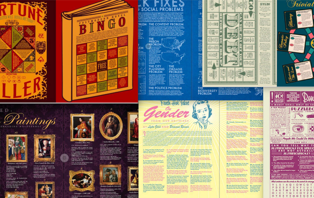
We are just putting out a brand new book, The Current Affairs Big Book of Amusements. (Available now for pre-order!) Here is the cover:

I did not (and could not) design this! It was done by Jon White, who has done beautiful posters for Chapo Trap House and the Social Wealth Fund paper for the People’s Policy Project. I did, however, design most of the inside pages, and I think you’ll find they are really fun. Here are a few:
The whole book is like that. Lyta and I worked very hard on it and we think you’re going to thoroughly enjoy it. But a lot of these designs, like a lot of Current Affairs’ ideas, are far less complicated than they seem. Selecting appropriate colors, as you can see, does wonders. There is a lot of pleasure in creating pages like this, in trying to figure out how to visually represent certain feelings or subjects, or just make a thing that looks cool. A lot of it is a trial and error process: Hm, this color looks a little off, or that box shouldn’t go there since it throws off the visual balance. The first version I make of anything looks horrible, and only after endless tedious efforts to try every possible variation do I finally get a result I think is perfect. Sometimes I’ll switch back and forth between two ever-so-slight variations (should this be pink then blue, or blue then pink?) trying to figure out which one makes the minutest improvement over the other. That may sound painful, but it’s also fun, because you get to watch something ugly slowly improve until it’s delightful.
I think learning design can be very, to use a meaningless word, “empowering.” It’s not that difficult to get a basic grasp of, and when you do understand, a lot of every day objects get “demystified” in a certain way. You realize not just that advertisements are calculated attempts at manipulation, but exactly how they’re manipulative, and you can see the chain of decisions that produced a certain endpoint. You realize how much “credibility” can be aesthetic—do you have glasses and a tie and sit in front of books? And you may begin, as I have, to develop more confidence in yourself, feeling that as you understand the parts that make up the world, you are less helpless, confused, and weak. There are lots of ways to get this feeling, and I’m sure some people do it by learning how mechanical things work, or studying psychology or math or physics. These, too, shed light on things that we are affected by without necessarily understanding. But an eye for design is certainly clarifying. It may not actually be useful to know how to create a CLIF® bar that you cannot eat. It does, however, open your eyes to patterns you’ve never noticed, and lets you see things through the eyes of producers rather than consumers. You’ll be better ready to fight the capitalists once you know all their design tricks.
The Current Affairs Big Book of Amusements is going to be spectacular and you should buy it! And, as always, if you appreciate our work, please consider making a donation, purchasing a subscription, or supporting our podcast on Patreon. Current Affairs is not for profit and carries no outside advertising. We are an independent media institution funded entirely by subscribers and small donors, and we depend on you in order to continue to produce high-quality work.


